Configuration
Gatsby themes allow you to override configuration from the theme by defining the same property in your
gatsby-config.js
gatsby-config.js
- Site metadata
- Manifest
- Theming
- Favicon
- Image compression
- Global search
- Navigation style
- Edit on Github link
- Medium
- Other options
Site metadata
To add a title and description to each page, simply provide them to siteMetadata in your
gatsby-config.js
The language attribute applied to the
<html>
en
module.exports = {siteMetadata: {title: 'Gatsby Theme Carbon',description: 'A Gatsby theme for the carbon design system',keywords: 'gatsby,theme,carbon',lang: 'en',},plugins: ['gatsby-theme-carbon'],};
Manifest
One of the first configurations should be to override the default manifest options, you can do this in
gatsby-config.js
siteMetadata: {title: 'Gatsby Theme Carbon',},plugins: ['gatsby-theme-carbon',{resolve: 'gatsby-plugin-manifest',options: {name: 'Carbon Design Gatsby Theme',
Theming
With theming, you can control the colors being used on the homepage as well as the interior pages. Your choices include
white
dark
g10
plugins: [{resolve: 'gatsby-theme-carbon',options: {theme: {homepage: 'dark',interior: 'g10',},},
Favicon
If you need to override the default favicon, you can do so by passing a relative path to the icon. It’s recommended to provide a 512 x 512 version.
IMPORTANT: For best results, if you’re providing an icon for generation it should be…
- at least as big as the largest icon being generated (512x512 by default).
- square (if it’s not, transparent bars will add to make it square).
- of one of the follow formats: JPEG, PNG, WebP, TIFF, GIF or SVG.
plugins: [{resolve: 'gatsby-theme-carbon',options: {iconPath: './src/images/custom-icon-512.jpg'},},],
Image compression
You can enable WebP by passing
withWebp: true
module.exports = {plugins: [{resolve: 'gatsby-theme-carbon',options: {withWebp: true, // true, false (default false)imageQuality: 50, // 0-100 (default 75)},},
Global search
Site-wide search is provided by the theme. The only requirement for a page to show up in the results is for it to have
title
description
Global search is enabled by default. To disable it, set the
isSearchEnabled
plugins: [{resolve: 'gatsby-theme-carbon',options: {isSearchEnabled: false},},],
Under the hood, we use Lunr to create our search index. If necessary, you tweak the search scoring algorithm and source nodes. To do so, provide your own resolvers object to the
lunrOptions
Navigation style
By default, the navigation style used by the theme is a sidebar that sits on the left-hand side of the screen. You can see it right now as you read this documentation. This style works great for websites with a lot of content, like documentation sites.
However, if your site is more editorial in nature, and has less pages of content, you may want to use the
header
To enable the header nav, provide
header
navigationStyle
''
navigationStyle
header
plugins: [{resolve: 'gatsby-theme-carbon',options: {navigationStyle: 'header',},},],
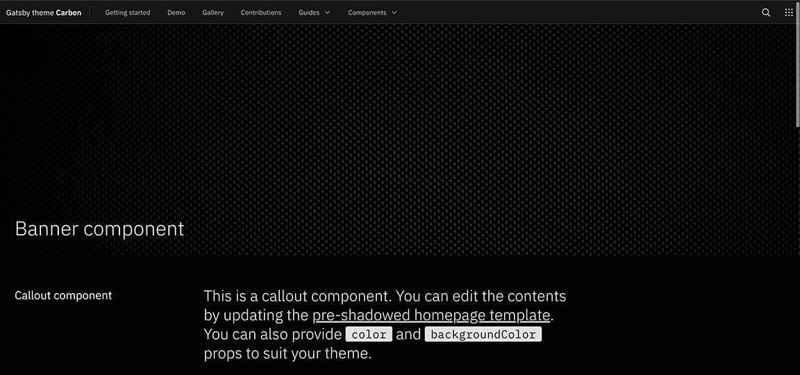
When enabled, your header navigation will look like the image below:

With the header navigation style enabled, the content on your page will be further left-aligned to allow for more content space.
Just a note: In mobile-view, when the header navigation is enabled, the sidebar will persist.
Edit on GitHub link
To add a link to the bottom of each page that points to the current page source in GitHub, provide a
repository
siteMetadata
gatsby-config.js
baseUrl
subDirectory
branch
To disable the
Edit in Github
repository
plugins: [{resolve: 'gatsby-theme-carbon',options: {repository: {baseUrl: 'https://github.com/carbon-design-system/gatsby-theme-carbon',subDirectory: '/packages/example',branch: 'main',},
Medium
In order to change the source account for the
mediumAccount
Multiple Medium Accountsplugins: [{resolve: 'gatsby-theme-carbon',options: {mediumAccount: 'carbondesign',},},];
plugins: [{resolve: 'gatsby-theme-carbon',options: {mediumAccount: ['carbondesign', 'design-ibm'],},},];
Other options
- – change the file extensions processed bymdxExtensions(default [‘.mdx’, ‘.md’]).gatsby-mdx
- - passisSwitcherEnabledto remove the Site switcher from the header navigation.false
- – pick between four formats for thetitleTypeelement for your site. Here are the four options using this page as an example:<title>
- : “Configuration” (default)page
- : “Gatsby Theme Carbon”site
- : “Gatsby Theme Carbon – Configuration”append
- : “Configuration - Gatsby Theme Carbon”prepend
plugins: [{resolve: 'gatsby-theme-carbon',options: {mdxExtensions: ['.mdx'],titleType: 'append'},},],
Additional remark plugins and override existing remark plugin configuration
- - An array containing gatsby remark plugin configurations to be added/overridden.gatsbyRemarkPlugins
- - An array containing remark plugin configurations to be added.remarkPlugins
The
gatsbyRemarkPlugins
gatsby-remark-mermaid
remarkPlugins
Example Gatsby Remark Mermaid plugin
For the below markdown snippet:
```mermaidgraph LRinstall[Install Plugin]install --> configure[Configure Plugin]configure --> draw[Draw Fancy Diagrams]```
to turn into an image one should add the following configuration to her/his own project:
plugins: [{resolve: 'gatsby-theme-carbon',options: {repository: {baseUrl: 'https://github.com/carbon-design-system/gatsby-theme-carbon',subDirectory: '/packages/example',branch: 'main',},
Example Remark Grid Tables
For the below markdown snippet:
+-------+----------+------+| Table Headings | Here |+-------+----------+------+| Sub | Headings | Too |+=======+==========+======+| cell | column spanning |+ spans +----------+------+| rows | normal | cell |+-------+----------+------+
After installing the
remark-grid-tables
remarkPlugins
plugins: [{resolve: 'gatsby-theme-carbon',options: {remarkPlugins: [require("remark-grid-tables")],},},],
Adding new MDX layouts
This would need to be added as custom components following this Layout component docs outlined by Gatsby.
Note that the layouts do not inherit from theme default. Custom layouts start from a clean slate. If you want to iterate on the Carbon template, copy
/gatsby-theme-carbon/src/components/Layouts/Default.js